Screen Printing Class At The Nevada Museum Of Art
 Frustrated by my lack of self discipline in spending my free time being creative, I decided to schedule a couple art classes at the Nevada Museum of Art. I've been running on chaos and subsequently have been feeling a road block when it comes to creating art at home. I've never screen printed nor have I ever done any formal print making so I thought this class would be just the thing to get me thinking outside the box.
The class had a cozy three person enrollment which leant to more personal attention from the teacher, Candace Nicol. She suggested we start out with drawing a loose design, using four colors including black. We were free to roam in the museum itself for inspiration (a few Andy Warhol pieces were in the exhibit upstairs). I'm definitely one who needs inspiration to create. I honestly can't just pull s*** out of my a**, with out some sort of preconceived idea.
***Disclaimer*** This is not meant to be a tutorial or a DIY post. I don't want you to get the idea that I know what I'm doing here, that I think I know what I'm doing, or that I'm trying to make you think that I know what I'm doing. I'm simply sharing what I learned since the process of screen printing has always been a magical mystery for me and I would like to give you a tour….
I brought my folder of art ideas and ended up with a paisley inspired flower. Not quite as loose of a drawing as recommended, which later came back to bite me in the BE-hind, but it's all about the learning process right?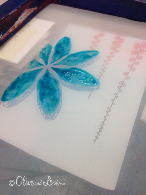
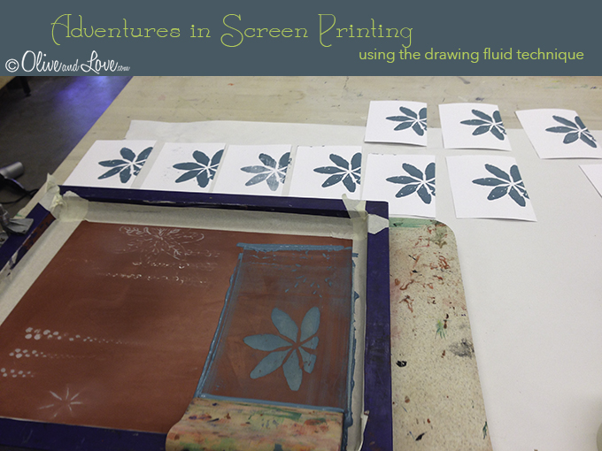
After the drawing was complete, I placed it under the provided 'screen' which is basically a wooden frame with a tightly meshed screen. Using a pointed paint brush and drawing fluid, I painted parts of my image four times in four different areas of the screen, one for each color.
Colors can be layered, so my intention was to have my flower blue, with the decorative leaves in green on top of the blue. Therefore my flower was drawn solid with the drawing fluid. The top right in the photo above is to be where I place the orange ink. The bottom left is for green and the bottom right is for black. The drawing fluid on the bottom right was placed on too thin and should have been thicker and perhaps slightly wider as it's hard to get a thick line that is also fine. You'll see what I mean in a few...
The next step is to paint emulsion fluid across the whole screen and let it dry, during which time we ate lunch. It was a cool day, so we all used a hair dryer to speed up the process. After it dries, you wash it, scrubbing with finger tips only to remove the drawing fluid, leaving what looks like a stencil. Tape is applied to edge of screen to protect where the frame and screen meet.
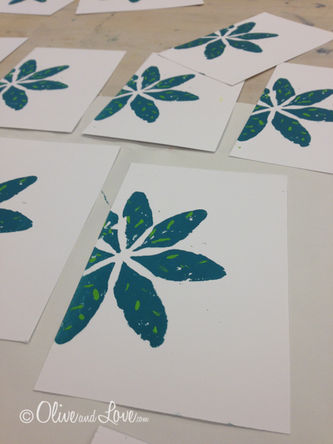
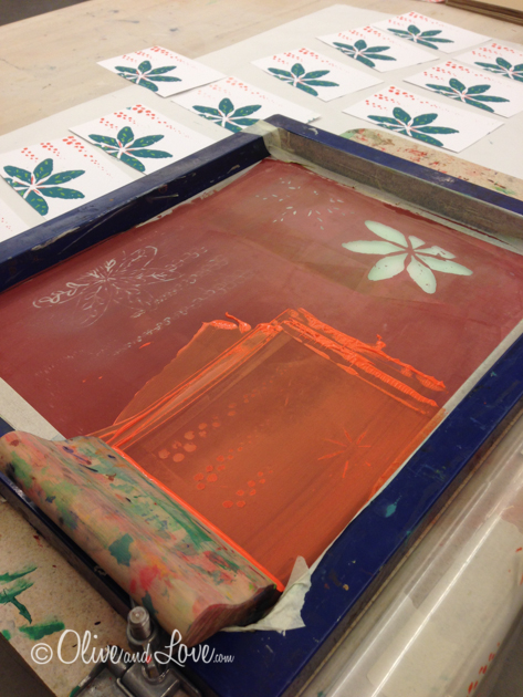
After using paper and tape to block off all the openings except my flower, I took my original drawing and placed it inline under the hole for the flower, lifted the screen (which is now attached to bottom board with hinges) and using painters tape, made an "L" to use as a guide in placing my papers. I dabbed my ink on the screen and using a squeegee with wooden handle, pressed very hard straight down onto the screen and pulled towards me. This squishes the ink through the "stencil". You have to do this fast. The slower you go, the more ink comes out, creating more of a goopy look. (I think that's the professional term.)
I repeated this same process using the green ink and the leaf type design for the flower petals. I used the tape in an "L" to line up my papers. For a more exact way, you can tape one side of a transparency under the screen, run the ink with the squeegee, lift the screen, lift the transparency, place your paper down, flip back the transparency and adjust it exactly. During this time you are using to make exact adjustments to every paper, your ink is starting to dry in the screen so you have to work fast. I chose to skip using the transparency and just relied on my tape guide. This is where you start to see that the looser your drawing, the greater your rate of success.
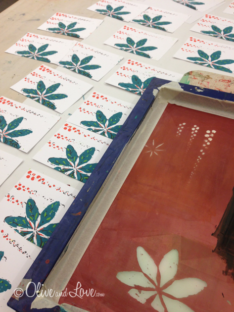
My next color of choice was a bright orange. Each of these colors we hand blended in small paper cups. In between each color, we removed as much of the acrylic based ink as possibly using paper towels so that the least amount possible would actually be rinsed down the drain. After washing the screen we dried it with a hairdryer.
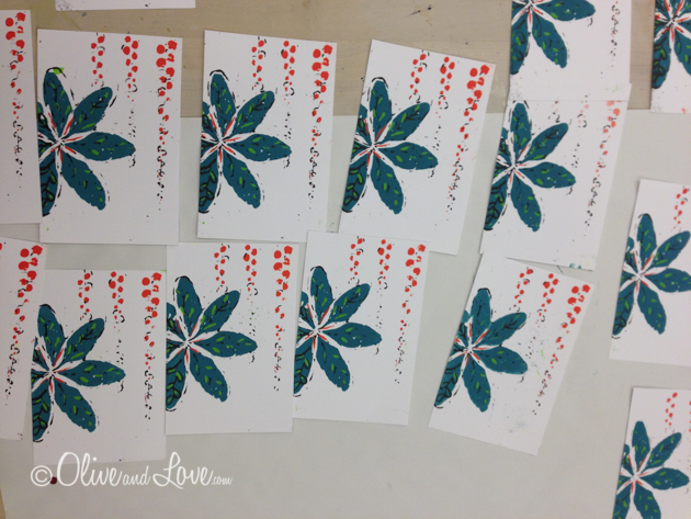
Finally the black, which was really a very dark, dark brown ink, premixed by Candace. Here's where you can see how my drawing fluid wasn't thick enough to remove the emulsion fluid. Had it been, I would have probably needed to use the transparency method to line up each paper since it's such a detailed design. By this time, however, class was already running over about 45 minutes. The four hour class needs to be pushed to five for sure.
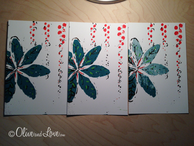
I love the pop that the dark brown makes in the areas where it actually worked. I love that each one is a bit different and that you never know what you're gonna get. The unpredictability of it is probably what is the most frustrating but also what can create some very awesome surprises.
Somehow the one on the far right had a very lightly washed out blue ink. Maybe with more practice you can try to replicate some of these variances….or not.
Candace mentioned that these pieces can always be used as the first step in your art work. Take them and draw on them, collage with them, journal on them...
I decided to outline one of mine with a paint pen at home. Meh. I like the organic texture of the screen printed ink mucho mejor.
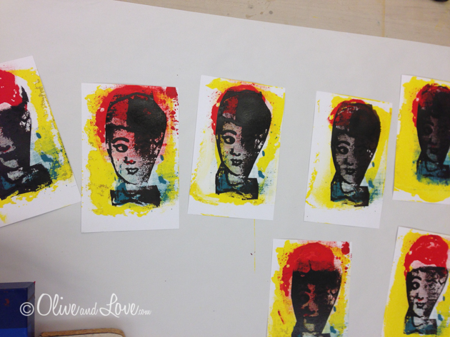
My classmate Randy traced a photo of his grandchild.
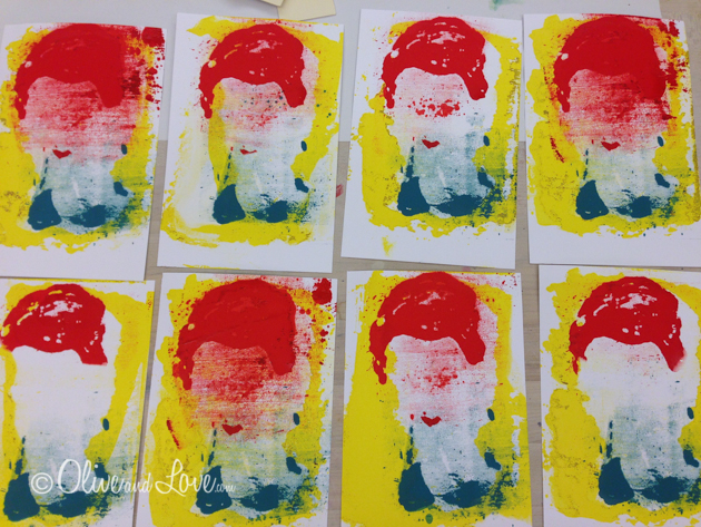
When washing off his drawing fluid, he scrubbed too hard, which took off some emulsion fluid, creating a blurred color effect, reminiscent of Andy Warhol.
The ink bled through on some more then others. I'm really quite fond of how these turned out. I love the repetition and can imagine perhaps three or five framed together.
Irene's cat came out fantastic. Her loose drawing was perfect for the screen printing process.
Candace Nicol made Christmas Cards for the class example. He is, of course a lizard for Truckee Meadows Community College.
Despite a 'perfect' finished product, the class was fantastic. My motivation for taking this class was to get myself back into creating art and taking time for myself. I'm really looking forward to the photo emulsion screen printing class I'm taking this weekend. I've also signed up for two online art classes Draw Happy by Jane Davenport and Willowing Arts Lifebook 2014


